
Visualizing CNNs in TensorFlow!
All Neural Network including convolutional Neural Networks are essentially black box, which makes them harder to debug. Debugging in this context does not mean finding errors in the architecture while coding the model but rather determining whether the trained model is truly able to achieve the projected test accuracy. Let me elaborate, after training the model we run the model on test data to obtain an accuracy of, let’s say, 80%. From this we assume that when we pick 10 random data points (images) outside the dataset, the trained model will classify 8 of them correctly. Unfortunately, that is not the case. Most of the dataset used for training the model are likely to have some biases, for instance, we can have a dataset for classifying the male from female images and unnoticed (let’s assume), we have most of the men in the dataset wearing caps. This could cause the model to predict people, either male or female, with hat as male. Unlike the previous example some biases are subtle and less apparent. This is not the only case where neural network fail; people can fine-tune an image from the train dataset itself to trick the network. Such examples are called Adversarial examples. Citing an example from the paper by Ian J. Goodfellow, we see network classifies an image as panda with a confidence of 57.5% and by adding a certain noise it classifies it was gibbon with 99% confidence, although the image remained virtually same for us.
Thus, in order to address such issues with training neural network we need to peer into the working of a neural network. This blog emphasizes some of the visualization methods used in Convolutional Neural Network.
This blog will be give you hands-on experience of implementation of various CNN visualization techniques. The order of various topics discussed in this blog is in coherence with the Lecture 12 | Visualizing and Understanding by Stanford University School of Engineering.
1. Visualizing Activations
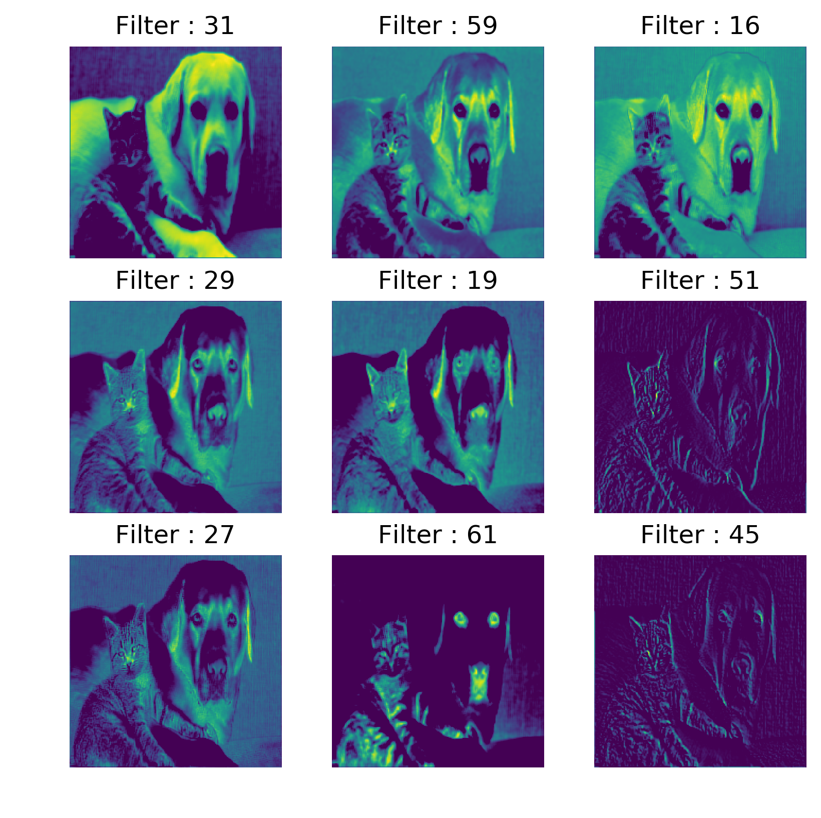
The structural parts of a convolutional neural network are its filters. These filters can identify from simple features to more complex features as we go up the convolutional layer stack. Since the filters are just stack of 2D matrices we can be plotted them directly. But these filters are either 3x3 or 5x5 matrices, plotting them would not reveal much about their nature, Instead we plot the activations or feature maps of these filters when we run an image through the convolutional network.
Code: visualize activations using TensorFlow (version 1.x)
Layer 5_3 (Last layer in VGG-16)
2. Plotting Feature vector
Feature vector of an image can be obtained from the output of the penultimate layer or the layer below the classification layer, in most of the architecture it is usually fully connected layer. The activation of each image obtained at this layer represents the feature vector of the image. The feature vectors obtained from many images can be plot using on a two-dimensional space using dimensionality reduction algorithms such PCA or t-SNE.
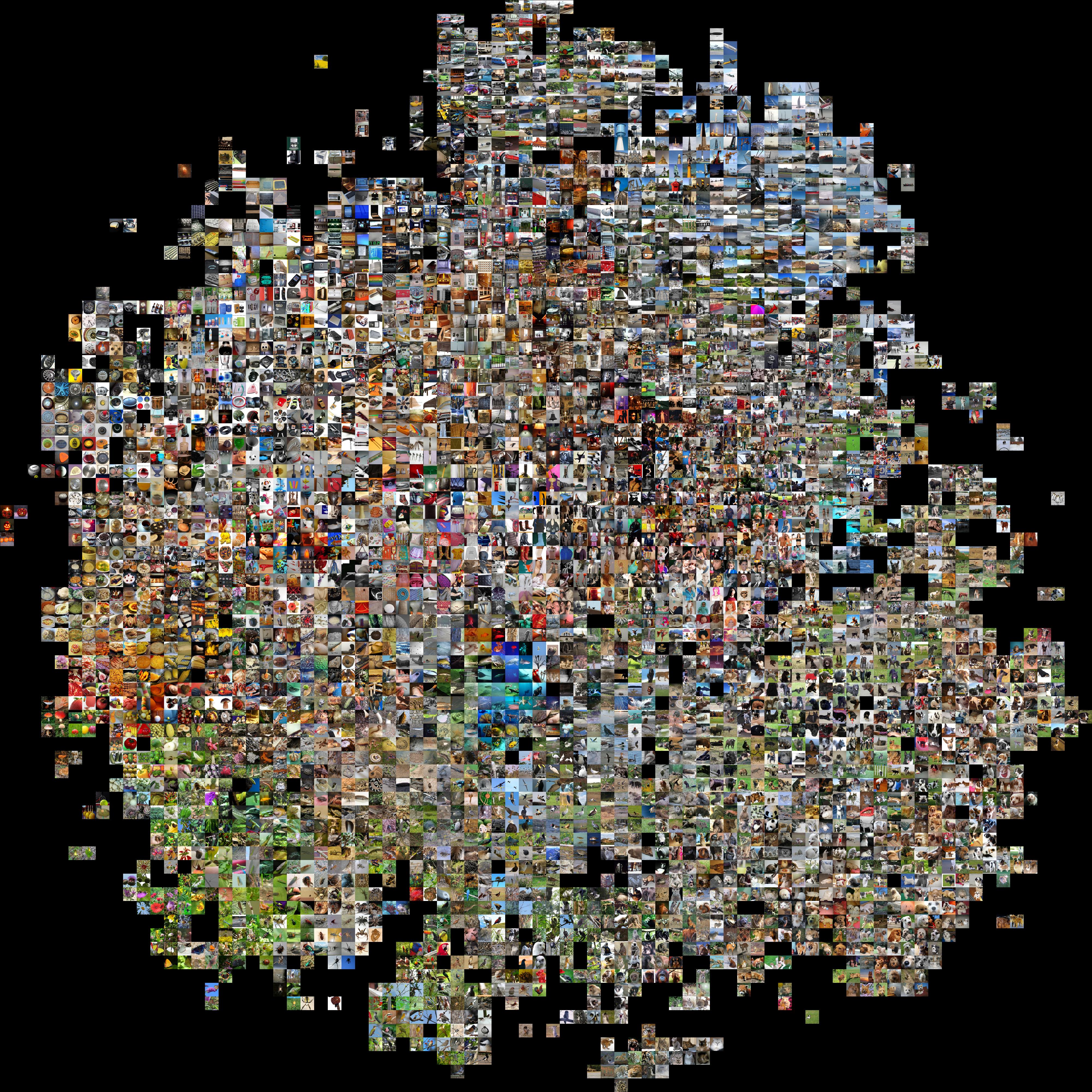
Embedded images in 2-D space using t-SNE
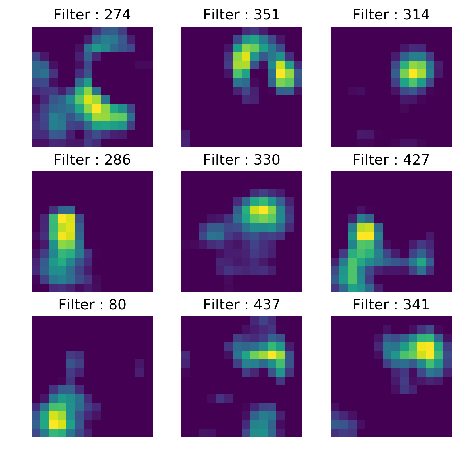
3. Maximally Activated Patch
This is similar to activation visualization- here, instead identifying the image which maximally activates the filter, we identify a specific sub-region of an image. By iterating over hundreds of similar images we can identify the feature a filter or neuron can identify; by producing maximum activation.
Maximally activated patches for 5 units
4. Occlusion Experiment
In occlusion experiment we block a portion of image and plot a heat map of the class probability obtained by placing a patch at different positions of the image. By doing this we are looking how each patch of the image is contributing to the class probability. Illustrating the below examples, the obtained occlusion probability distribution is the function of class probability obtained when the region is masked(or blacked out) and this implies the lower probability value in the heat-map indicates that the region is essential in determining the class of the image.
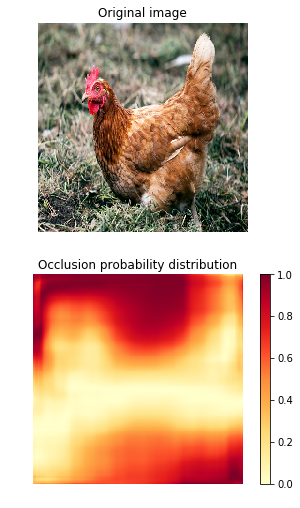
Example 1 - Class: Hen
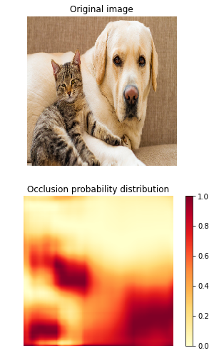
Example 2 - Class: Labrador
Code: Occlusion using TensorFlow (version 1.x)
From the above TensorFlow implementation of occlusion experiment, the patch size determines the mask dimension. If the mask dimension is too small we would not find much difference in the probability variation and on the other hand if the mask size is too large we cannot precisely determine the area of the interest that influences the class probability.
5. Saliency Maps
This is a gradient based approach in where we compute the gradient of output class Yc w.r.t input image. In Saliency maps, we can identify those set of pixels that are used for determining the class of the image. This method is quite efficient because we can identify the pixels with just single backpropagation. In the paper Deep Inside Convolutional Networks, the authors demonstrate that saliency maps produce better object segmentation without training dedicated segmentation or detection model. The following images are the saliency maps obtained for the above examples.
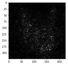
Saliency maps for Hen (Example 1)
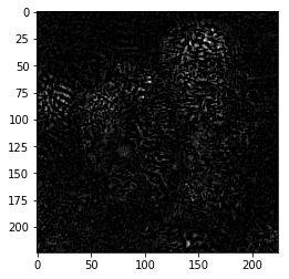
Saliency maps for Labrador (Example 2)
Code: The TF(version 1.x) code for the this visualization is fairly straight forward as shown above.
6. Visualization using Guided backprop
Before get into this method I like to give an overview of deconv net since it is used to produce similar visualization as that of guided backprop approach. In Deconvnet, the feature activation of intermediate layers is mapped back to the input image. The initial input image is a zero image. In this approach the convolutional layers are replaced with deconvolutional layer(which is an unfortunate misnomer since there is no Deconvolutional operation happening in this layer), and pooling with unpooling layer, which consists of switches which record the positions of max values during the max-pooling thus obtaining approximate inverse of max-pooling. Personally it didn’t look simple to implement so I am just using examples from the paper itself to show you what the results look like. The following figure illustrates the deconvnet.
This sort of visualization can be achieved by simply replacing the Relu activation function with guided Relu as proved in the paper - STRIVING FOR SIMPLICITY: THE ALL CONVOLUTIONAL NET. The working of guided relu is illustrate in the following figure.
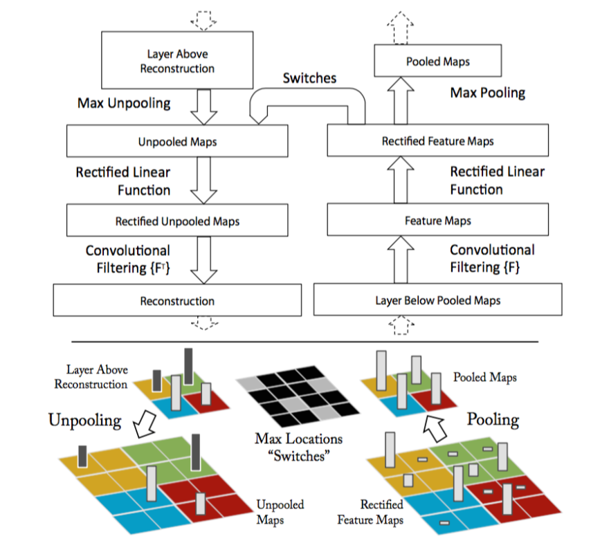
DeconvNet
Ref: Visualizing and understanding CNNs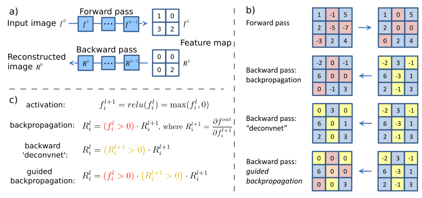
- Given an input image, we perform the forward pass to the layer we are interested in, then set to zero all activations except one and propagate back to the image to get a reconstruction.
- Different methods of propagating back through a ReLU nonlinearity.
- Formal definition of different methods for propagating a output activation out back through a ReLU unit in layer l
The following are the results obtained for the above mentioned two example images using guided backpropagation.
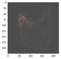
Guided backprop for Hen image
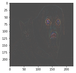
Guided backprop for Dog image
While being simple to implement, this method produces sharper and more descriptive visualization when compared to other methods even in the absence of switches. The following is the implementation of Guided backpropagation using TensorFlow.
7. Grad-CAM
We can consider Gradient weighted Class Activation Maps (Grad-CAM) as an upgrade to Class Activation Maps, which are produced by replacing the final fully connected layer with Global-Max pooling,requiring to retrain the modified architecture. The Class Activation Maps over the input image help to identify important regions in the image for prediction. Grad-CAM are more interpretable when compared to other methods. This method produces the gradient map over the input image, using the trained model, thus enables us to give better justification for why a model predicts what it predicts. In the Grad-CAM paper, it is elucidated that Grad-CAM is more interpretable, and faithful to the model which makes it a good visualization technique. The best thing about Grad-CAM is that it does not need the model to be retrained; we can use Grad-CAM on the trained model right of the box.
Pixel-space gradient visualizations such as deconvnets or guided backpropagation produce fine grain details but cannot distinguish different categories, thus we observe both cat and dog details in the image produced by the Guided backpropogation method for Example-2 . We can leverage the highly class-discriminative nature of Grad-CAM to produce better localization or identifying the attention of the trained model over the image.
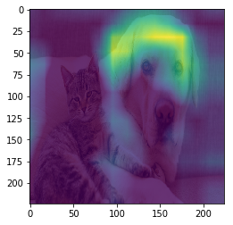
Grad-CAM for category - ' Labrador '
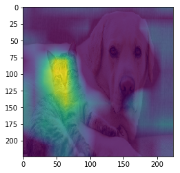
Grad-CAM for category - 'tabby cat'
Code: TensorFlow(version 1.x) implementation of Grad-CAM.
References
- Visualizing activations - Understanding Neural Networks Through Deep Visualization
- Plotting feature vector - t-SNE visualization of CNN codes
- Occlusion Experiment & Deconvnet - Visualizing and Understanding Convolutional Networks
- Saliency Maps - Deep Inside Convolutional Networks
- Guided Backpropagation - STRIVING FOR SIMPLICITY: THE ALL CONVOLUTIONAL NET
- Grad-CAM: Visual Explanations from Deep Networks via Gradient-based Localization
- Global Avg pooling code
- Vgg16 model - http://www.cs.toronto.edu/~frossard/post/vgg16/
- Vgg16 model weights - https://github.com/ethereon/caffe-tensorflow
- Google Colab notebook for this blog - https://github.com/TejaSreenivas/blog_CNN_visualization/